The Cover Has Five Seconds
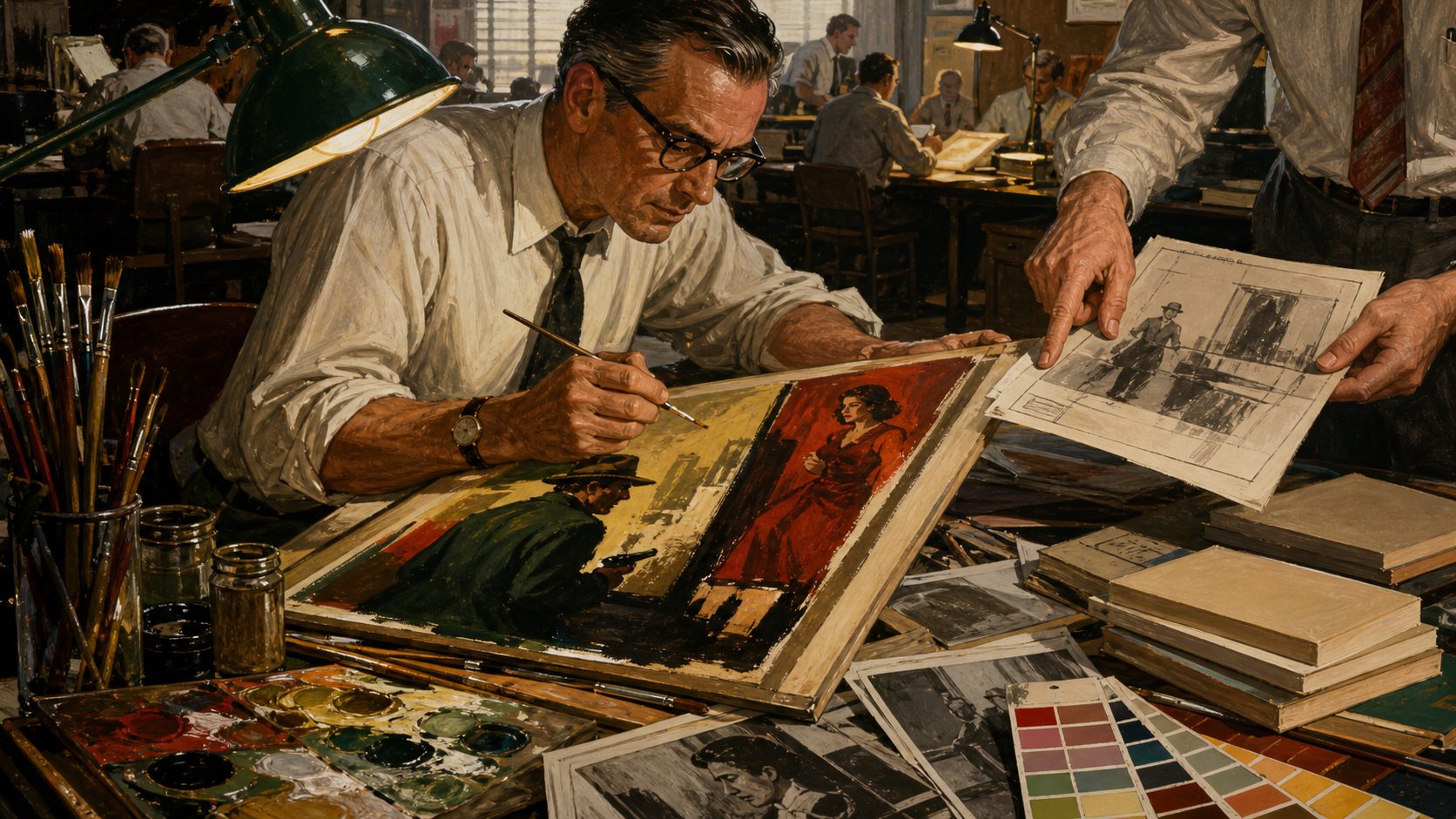
Before a pulp paperback could tell you a story, it had to interrupt one.
Picture the buyer. He's walking through a drugstore, or killing time at a bus stop, or standing in front of a wire rack packed with a couple hundred spines and a dozen face-out covers, all of them shouting at once. The cover had maybe five seconds to make him stop. Not to explain itself. Just to raise a question loud enough that his hand slowed down on the way past.
People like to treat cover art as the pretty thing that got bolted on after the real work was finished. That's exactly backwards. It was storytelling too, done fast, done cheap, done under conditions that would make a gallery painter weep.
The compressed predicament
The best covers don't summarize the plot. They can't, and they shouldn't try. What they do is freeze one bad moment. A man opens a door and sees something he wasn't supposed to see. A woman stares at something coming for her that we can't see at all. A hand slides toward a gun while the other person in the frame keeps smiling. Put two bodies close together with the wrong amount of space between them and you've suggested betrayal, or lust, or both, without a word.
The trick is that the viewer finishes the picture himself. What just happened? Who's about to get hurt? Why is that door open? You buy the book to find out, and the cover has already collected its fee in curiosity.
Which is also where the honest problem sits. A painting can get every literal detail wrong, the wrong coat, the wrong room, the wrong century, and still nail the exact dread at the center of the book. It can also promise you sex and monsters and mayhem that the novel never once delivers. The same brush that paints a small piece of visual poetry can paint a bald-faced lie, and the reader on the rack has no way to tell which one he's holding.
Read from across the aisle
Here's a thing modern admirers forget: these paintings were made big and printed small. Fine detail just evaporated in the reduction. So the smart illustrators built for the shrink. A clean silhouette. Contrast you could see from across the store. A pecking order so obvious that the face, or the gun, or the burning house read from six feet away even when everything else turned to mud.
Color did a lot of the talking, and it talked before anyone read the title. Crime went for dangerous reds, midnight blues, that sickly nicotine yellow, and shadows you could drown in. Gothics leaned on moonlit blue and a queasy green and the one white nightgown running from the big dark house. Science fiction got skies that never existed. Westerns sold you dust and leather and hard sun.
Regular buyers learned to read all of it without ever being taught. The rack ran a color class every day and nobody knew they were enrolled.
The copy joins the painting
The painting never had the cover to itself. Title, author, series number, tagline, publisher logo, all of it fought the illustration for the same few square inches. A gorgeous painting could be wrecked by ugly lettering. Strong type could haul a muddled concept back from the dead.
The good designs made the two things work together instead of elbowing each other. A figure turned to look toward the title. A shadow opened up a clean pocket for the copy. A slashing diagonal, a body, a raised weapon, dragged your eye across the whole thing in the order the designer wanted. You saw the picture, you read the promise, and you came back to the picture already suspicious of it.
Art under commerce
Calling this commercial art isn't an insult, and I'm tired of people using it as one. Commerce handed the artist the problem. The artist went and solved it with anatomy, color, gesture, light, and a merciless eye for what to leave out.
The deadline could be brutal. The fee often bought the publisher the painting outright, so the guy who made it walked away owning nothing. The brief could be flat wrong, or stupid, or based on a plot summary written by someone who clearly hadn't read the book. And yet James Avati, Robert Maguire, Robert McGinnis, Mitchell Hooks, Barye Phillips, Rudolph Belarski, and a long list of others turned out pictures that outlived the paperbacks they were hired to move.
That success tempts us now. Strip off the type, hang the bare painting on a wall, admire the brushwork the design used to hide. Fine. Do it. But understand you've also erased the original feat. These pictures were built to live alongside words and a price and a format and a distracted customer in a hurry. Take all of that away and you're seeing something the artist never actually made.
The first contract
Every cover signs a contract with the buyer. Open me and you'll get danger of this particular flavor. The novel inside can honor that promise, complicate it, or flat-out break it, and plenty broke it.
So the critic has two jobs at once, and I don't think you get to skip either. Look at the painting as a picture: what's it feeling, who's it picturing as its ideal reader, whose body just got turned into merchandise. Then look at it as a sales tool: what true thing did it find in the story, and what lie did it tell to move one more copy off the rack.
Five seconds really isn't much time. The great covers made it plenty.